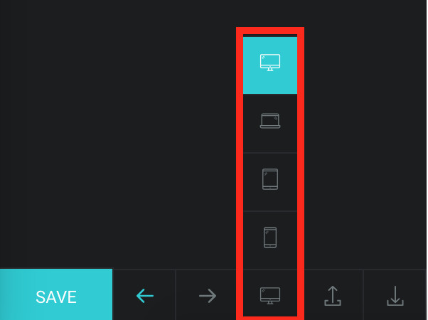
To make the layout of your web page optimised on all screen sizes, we have included Responsive controls for various settings in Tatsu. Modifying a setting responsively is pretty straight forward in TATSU as you will have visual preview of the screen on which you are making the edits. The option to change the view port is present in Bottom Bar of the Left Panel.

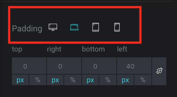
While editing the settings of any module in TATSU, you need to look for a small monitor icon beside the label of the setting. This icon means, the field can be changed responsively.
Just click on the icon, and 4 icons representing view ports will be seen. Click on each view port icon to edit the value of that setting. Once you click on the view port, the display on right panel will also be changed so you can view your changes instantly.

1. The changes made in the responsive settings will only be applied for the particular device. For ex. if you are modifying the Padding Value for Laptop device, the change will apply only for Laptop screens and Tablet and Mobile will still hold the default values.
2. Device Size Window –
Mobile < 767px
Tablet – 768px – 1024px
Laptops – 1025px – 1377px
Desktops – > 1378px